Explore+
The following tutorial will describe how to navigate and use the tools available on the Explore+ page. You will need to log into your account to view the Explore+ page (Fig. 1).

Selecting the count station locations
I want to explore…
You will first need to select if you want to explore by organization, region, or state (Fig. 2). Users are limited to exploring data they have direct access to. For example, if you’re an organization that is part of an established regional partnership, you will have access to view your organization’s data and the data from all participating partners in the region. Once you’ve made your selections under the “I want to explore…” menu and click “Explore”, the map will reorient to your geographical selection.
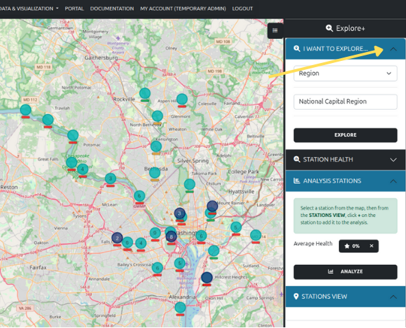
Once you’ve selected the jurisdictional level of data to explore, you can now explore what count station locations are available and decide which count stations you are specifically interested in.
Some location icons include a number. This indicates the number of count lactions available within that area. As you zoom into the map, the icons will disaggregate into their respective locations.
Station Health and Data Availability
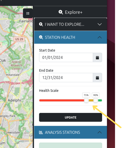
The Station Health filters provides a high level overview of how much data are available at each count station location. Data availability is calculated as the number of observations recorded and received divided by the number of expected records (daily). For example, if a count location expects hourly data the expected number of observations is 24 within a day. If a specific count location only has 18 recorded observations, then the data availabilty would be 75%. The filters available are “Start Date”, “End Date”, and “Health Scale”. The “Health Scale” is adjustable depending on how you define what is “good” (green), “suspicious” (yellow), or “bad” (red). You will be able to set the threshold values for “good”, “suspicious”, and “bad” using the sliders under the “Station Health” option (Fig. 3). Once you’ve defined these filters and click update, the map will update accordingly. You will also be able to define the date range of data of interest.
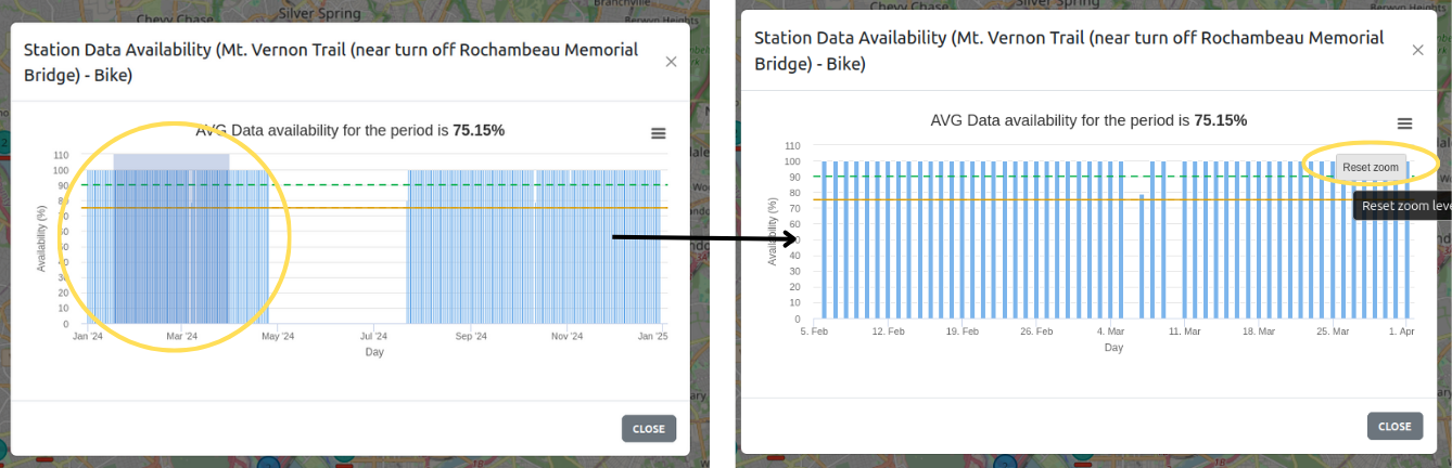
Once your thresholds are set you can click on a single or multiple stations of interest. Each station selected will show up under “Stations View” in the right sidebar. To view the data availability, click on the colored bar with the star that indicates the data availabilty for the date range (Fig. 4).
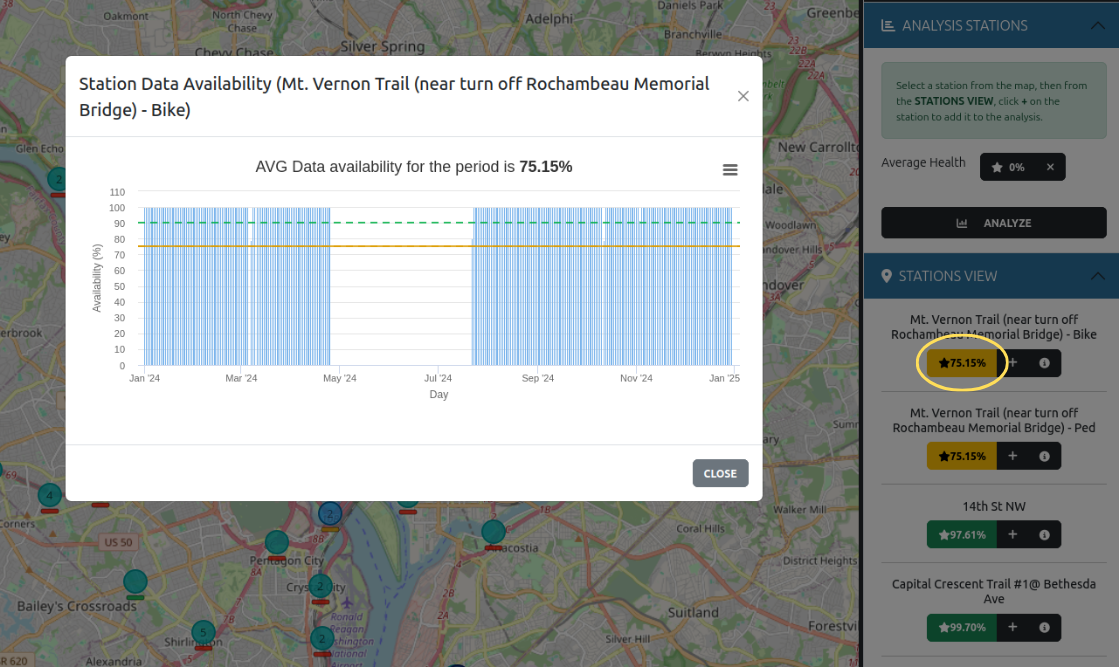
As with almost all figures, if you want to zoom into a specific date range on the figure you can click and drag the area of interest. To reset the zoom to the original x-axis range, click on the “Reset Zoom” button in the upper right corner of the figure (Fig. 5).
Analyzing Data
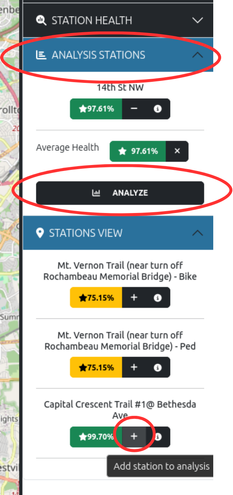
To further analyze and explore data for a single or multiple stations, click the “+” symbol that is located next to the colored star bar (Fig. 6). Each time a station of interest is selected by clicking the “+” symbol, it is added under the “Analysis Stations” section of the right sidebar. Once the stations of interest are selected, click “Analyze”.
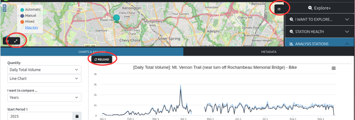
Once the “Analyze” button is clicked, a new window will appear in the lower half of your screen. If the new window doesn’t appear, click on the “chart” icon in the lower left hand corner of the screen (Fig. 7). And, if at first no data is shown is shown, click the “Reload” button. (And make sure your selected locations are listed under the “Analysis Stations” section.)

To expand the “Charts & Analysis” window, you can either click on the “zoom in” arrow icon, located next to the “chart” icon, or you can drag the window boarder to your preference. To temporarily hide the right sidebar menu options, click on the “cheeseburger” (Fig. 8).
The left sidebar menu on the “Charts & Analysis” tab shows all the available filters and metrics available (Fig. 9). The default “Quantity” is set to “Daily Total Volume”; other options are MADT, AADT, and weekday and weekend AADT (AAWDT and AAWET, respectively).
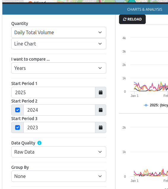
You can also set the timescale comparison to years (default), months, weeks, and days. This allows you to compare historical data for up to three different periods. If you find that it would be beneficial to compare more time periods, please let us know and we’ll consider it for the next update.
The level of data quality used for calculating the different quantities can also be selected: raw, corrected, validated (default), and validated only. The definitions are provided when you click on the “i” icon:
- Raw Data: Uses raw data as collected from the sensors without any corrections or adjustments.
- Corrected Data: Uses corrected data (adjusted for known issues or biases) if available. Otherwise, it falls back to raw data.
- Validated Data: If the data is not reviewed or is reviewed and marked as valid, similar logic to Corrected Data. If the data is reviewed and not marked as valid, the observations are ignored as if there is a data gap.
- Validated Data Only: If the data is reviewed and marked as valid, similar logic to Corrected Data. Otherwise the observations are ignored as if there is a data gap.
By default, data are displayed at the flow detector level of direction of travel and mode (e.g. bicycle, pedestrian, scooter). The “Group By” filter provides several levels of aggregation:
- Direction: aggregation based on direction of travel regardless of travel mode.
- Mode: aggregation based on mode of travel regardless of direction.
- Station: Aggregation of all travel modes and direction.
Once you’ve set your filters, click the “Reload” button to refresh the visualizations. Any time any filter is updated, the “Reload” button must be clicked.
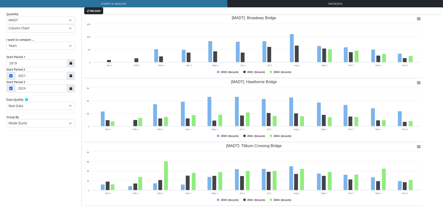
Example: Comparing MADT for bicycles pre- and post-pandemic
The steps to calculate the MADT for bicycles and compare three years worth of data is as follows:
- Set the “Quantity” to “MADT”.
- Set the visualization output to “Column Chart”.
- Select the “Start Periods” to 2019, 2021, and 2024. Make sure the boxes are checked for periods 2 and 3.
- If you’re unsure of the data quality, set to “Raw Data”. You can always change this option later.
- Set “Group By” to “Mode (Sum)”.
- Click “Reload”.
In this particular example, we’re comparing three years worth of available MADT data on the Broadway Bridge, Hawthorne Bridge, and Tilikum Crossing Bridge in Portland, Oregon (Fig. 10). Missing MADT values indicate not enough data was available for the calculation. Based on these values, it looks like the number of bicycle trips across the Tilikum Crossing Bridge are rebounding to pre-pandemic levels. Travel across Hawthorne Bridge remain lower, and not enough data are available for the Broadway Bridge.