Pedestrian Estimated Volumes From Push Button Actuations
The pedestrian estimated volumes from push button actuations is now available on BikePed Portal. The model and research supporting this work was conducted for Oregon DOT by Kothuri et al. (2024). The final report can be found here.
The following sections will guide you through the different tools available on the Push Button Actuations page. A video tutorial is also available here.
Step 1: Selecting your station(s) of interest
There are two ways to select your station(s) of interest: A) select by clicking on the different locations on the map, and B) select by using the filtering options on the metadata table.
A) Selecting by using the map
The map viewing boundary is set at the state level. The number within each circle icon indicates the number of locations that are available within that area. As you zoom in, the circle icons will disaggregate into more circle icons as the location of the intersections become more accurate. Each time you select a station by clicking on a circle icon, the icon will change to a light blue color and a list of stations representing that icon will show up on the right sidebar under “Stations View” (Fig. 1).
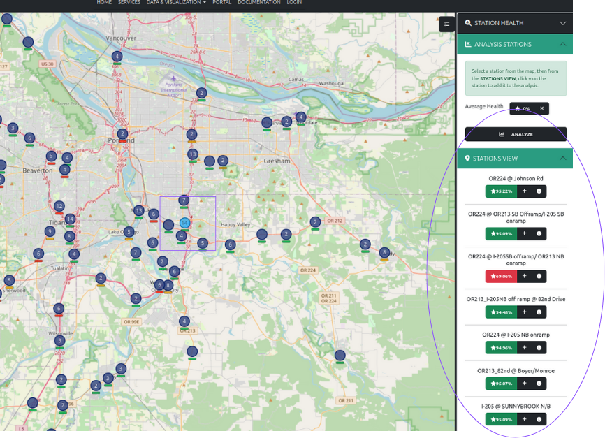
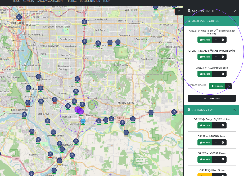
From the “Stations View” sidebar, click on the “+” to add it to the “Analysis Stations” for futher analysis and visualizations (Fig. 2). The selected stations for further analysis will change the circle icons on the map from blue to purple. To unselect a station from the “Analysis Stations”, click the “-“ button located under the station name.
If you click the “i” icon next to the “+” or “-“ buttons, a pop-up of the basic metadata for that station will appear.
B) Select by using the “Metadata” table filters
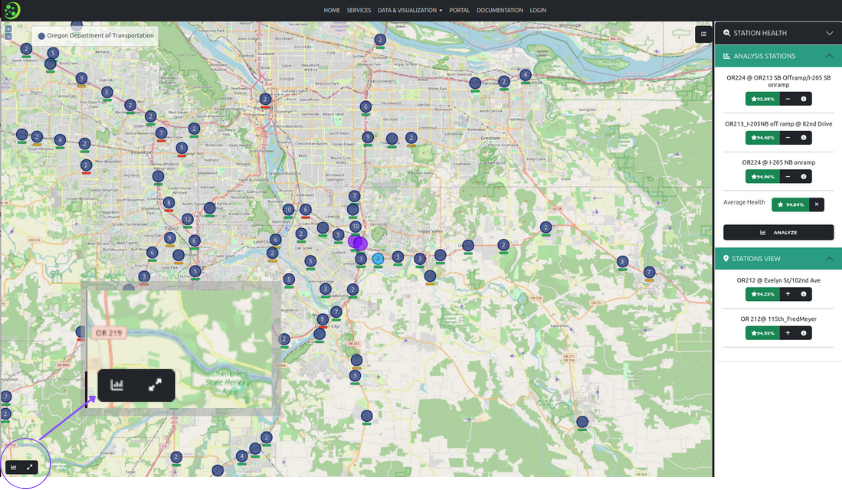
The second way to select stations is to use the “Metadata” table filters. To get to the “Metadata” table, click on the “graph” icon in the lower left corner of the map (Fig. 3). Once you click on the “graph” icon, a bottom panel will pop up with three labeled tabs.
By selecting the “Metadata” tab, a metadata table for all the stations will be displayed along with the filter menu options on the left sidebar (Fig. 4).
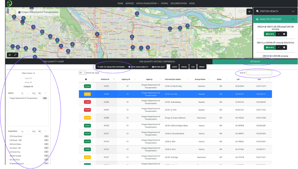
The bottom panel can be expanded moving the mouse cursor to the upper edge of the panel and then clicking to drag the panel up or down. You can either use the search window located in the upper right of the metadata panel, or use the filter options on the left sidebar of the panel to find the stations of interest. To add stations from the metadata table to the “Analysis Station” selection, click on the “+ add to analysis stations” button located at along the top border of the panel. You will also notice additional options to display the selected stations on the map, examine the data availability, and to download the metadata table in a variety of formats.
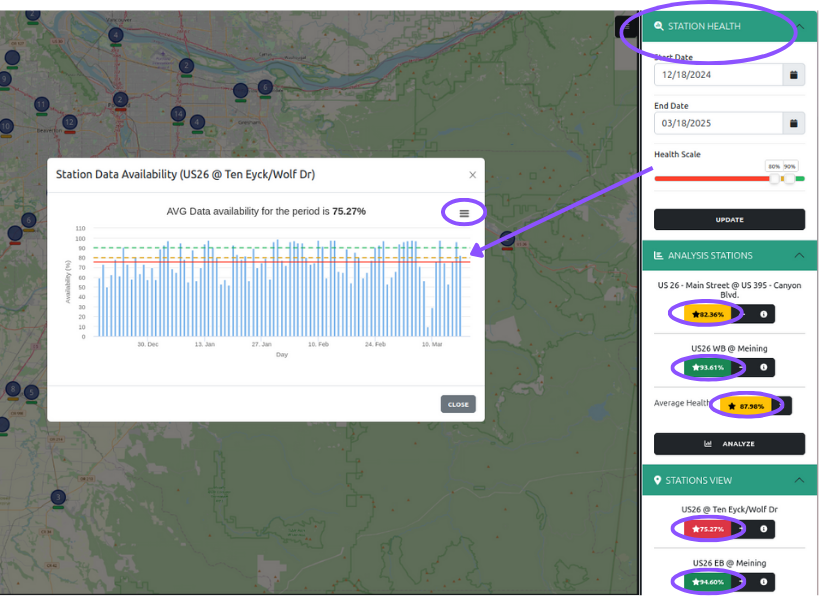
Step 2: Check the “Station Health”
For each station selected, or for any station of interest, you can also check the station “health”. By now, you will have noticed a color bar under each of the stations icon. The health of each station is determined by the amount of data received over the amount of data expected within a fifteen minute period. This means that we expect four records per hour, regardless of if a push button was actuated as long as there is signals data. Within one day we would expect 96 records (four records per hour, 24 hours per day). This lets the user know that even if there are no pedestrian actuations, data is still being generated by the signal (e.g. it is not common for a pedestrian to push the pedestrian button at 3am, but the intersection is still online).
You can set the “Health Scale” and date range of interest by using the filters under the “Station Health” menu within in the right sidebar. After you’ve set your thresholds, don’t forget to click the “Update” button. To check the data availablity of a given station, click on the star button located underneath the station name, and the data availibility figure will pop-up showing the selected date range and thresholds (Fig. 5). The hamburger menu (the three stacked bars in the upper right corner of the data availability chart), will allow you to either download an image of the chart or the data being used to generate the chart.
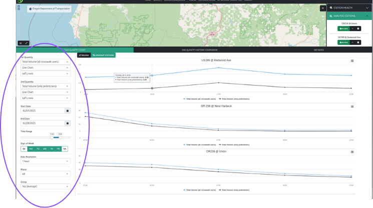
Step 3: Analyze data using the “Two-Quantity Chart” option
Once you’ve selected the stations you want to analyze you can either click the “Analyze” button under the “Analysis Stations” menu in the right sidebar, or you can click the graph icon in the lower left corner of the map (Fig. 3). A lower panel will appear with the default tab set to “Two-Quantity Chart”. If main area of the lower panel is blank, check the selected date range (in most cases data are lagged by one day). Once you’ve selected a date range, click the “Reload” button. Anytime you update a filter or parameter you must click the “Reload” button for those changes to take effect. If you’ve selected more than on station, by default, the chart will display the average of the selected stations (Fig. 6A). To show the values for each individual station, select the “Ungroup Stations” button and then click the “Reload” button (Fig. 6B).

Data display options There are three models that were employed to estimate pedestrian volumes:
- All crosswalk users
- Pedestrians, skateboarders, and wheelchair users
- Pedestrian only For more information on how these three models were derived, please refer to the final report Kothuri et al. 2024. Each of these models are available to display. In addition you can also display the data availability.
You can also display the data available for each station or average among all selected stations. Remember that for each out we expect four records per hour because we ingest data at 15-min aggregated level. The models used to calculated the estimated volumes are based on hourly data.
Example
The right sidebar displays all the selectors and filters that will allow you to do some basic visualizations and manipulations. For example, if you’re interested in the hourly weekday PM peak estimated total volumes for all crosswalk users compared with pedestrians only, you would select the follow parameters (Fig. 7):
- 1st Quantity: Total Volume (all crosswalk users), Line Chart, Left y-axis
- 2nd Quantity: Total Volume (only pedestrians), Line Chart, Left y-axis
- Start Date: 02/01/2025
- End Date: 02/28/2025
- Time Range: 15:00 - 19:00
- Days of Week: Mon - Fri (unselect Sunday and Saturday)
- Data Resolution: 1 hour
- Phase: All
- Group: Yes (Average)
Note: You can zoom in and out of the chart by selecting any section within each of the chart panels. A “Reset zoom” option button will pop-up to reset. Again, you can download the chart image or the data behind the chart by selecting the hamburger menu in the upper right corner of the chart panels. You can also click on the legend options at the bottom of each chart panel to turn a specific quantity “on” or “off”.
Step 4: Analyze historical data one quantity at a time
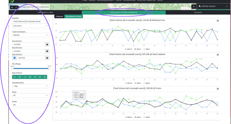
For historical comparisons, select the “One-Quantity Historic Comparison” tab. We allow one quantity comparisons at a time otherwise it becomes visually cluttered. For historical comparisons you can compare by days, weeks, months, or years, and up to three periods. You have the same filters and parameters as provided for the Two-Quantity Chart visualization.
Example
In this example, we want to compare monthly daily total volumes for all crosswalk users. The following parameters were selected for several stations (Fig. 8):
- Quantity: Total Volume (all crosswalk users)
- Line Chart
- I want to compare: Months
- Start Period 1: 12/2024
- Start Period 2: 01/2025
- Start Period 3: 02/2025 (this is selected with a checkbox)
- Time range: All
- Days of Week: All
- Data Resolution: 1 day
- Phase: All
- Group: No